Old is New Again
Posted: 05 June 2020
Posted: 05.06.2020

The old saying that fashion is cyclical seems to be ringing true recently with environmental graphics, as old styles of signage, graphics and typography are being reinvented for a modern audience.
Whilst it is said that 50 years is required for a fashionable look to come back in style, some recent design projects go back a lot further.
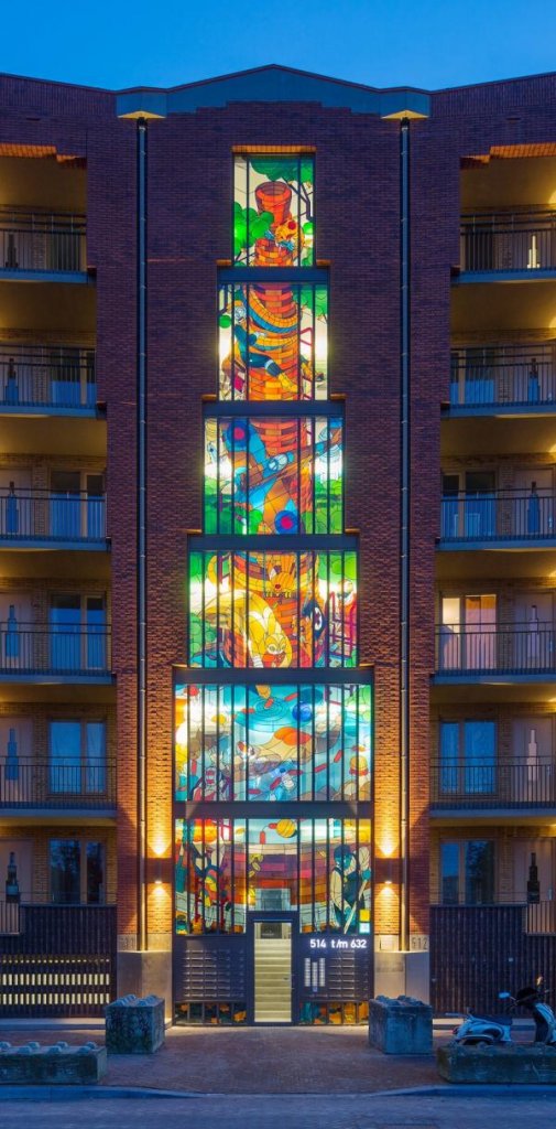
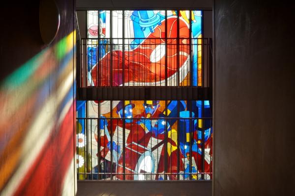
Stained glass windows make a reappearance in this first project by Dutch-based illustrator Stefan Glerum. Two new super-scale designs that depict the history of the building’s area adorn a residential project in Amsterdam and combine a centuries-old glazing technique with a graphic style reminiscent of the Art Deco or Bauhaus movements.
On a smaller scale, we’ve also started to see signage styles replicate the techniques of eras gone by.
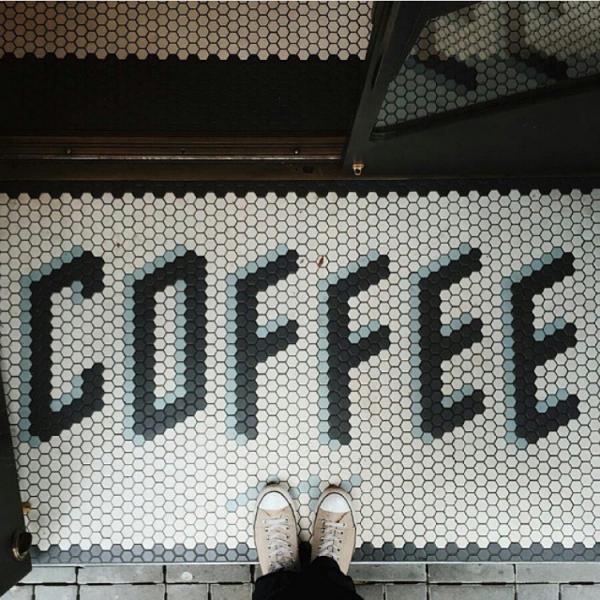
This floor-marker signage seen at Sightglass Coffee in San Francisco uses mosaics to provide a fun twist on typography. Taken by @mihailonaca via @canva
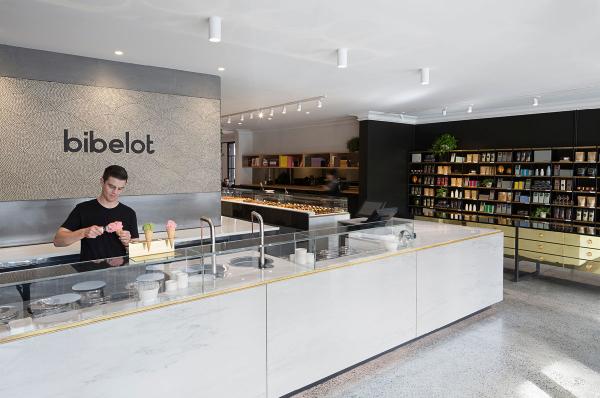
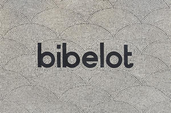
Designed by A friend of Mine, the new euro-style dessert restaurant in South Melbourne features a custom-mosaic wall signage. The crafted typography with intricate patterns in a bold and geometric typeface gives a sense of modernity whilst drawing on the traditional techiniques of tiling and gives this boutique a sense of place.
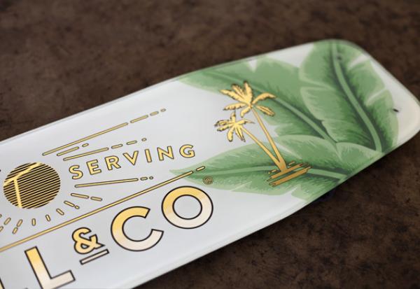
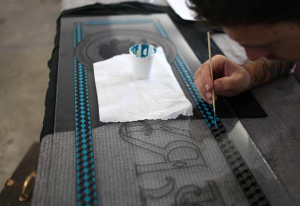
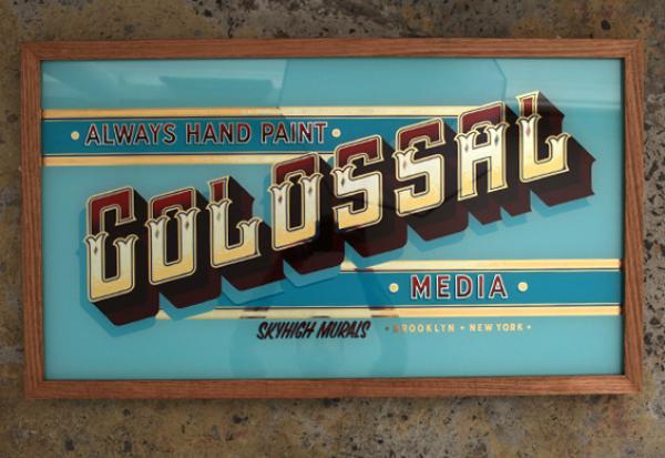
And closer to home, Sydney-based Lynes & Co are doing some beautifully hand-crafted work with traditional signwriting techniques.
