Navigating The Star
Since 2017, THERE has designed the wayfinding for The Star Entertainment Group across three integrated resorts in Sydney, Brisbane and the Gold Coast. Throughout each engagement, the work has developed as a single system: a wayfinding family that carries the same underlying language from site to site, while flexing its expression to suit the scale, materiality and mood of each place.
Sydney established the strategic and formal foundations, following an audit of its existing signage and a program of user-journey ‘wayfinding safaris’. Brisbane then tested that language at a larger, more complex scale within the impressive Queen’s Wharf development. The Gold Coast softened it again for a more relaxed, coastal arrival experience.
Read together, the three projects show how a wayfinding system can mature over time – proven in one place, stress-tested in another, refined in a third – while remaining unmistakably one family.
A Shared DNA
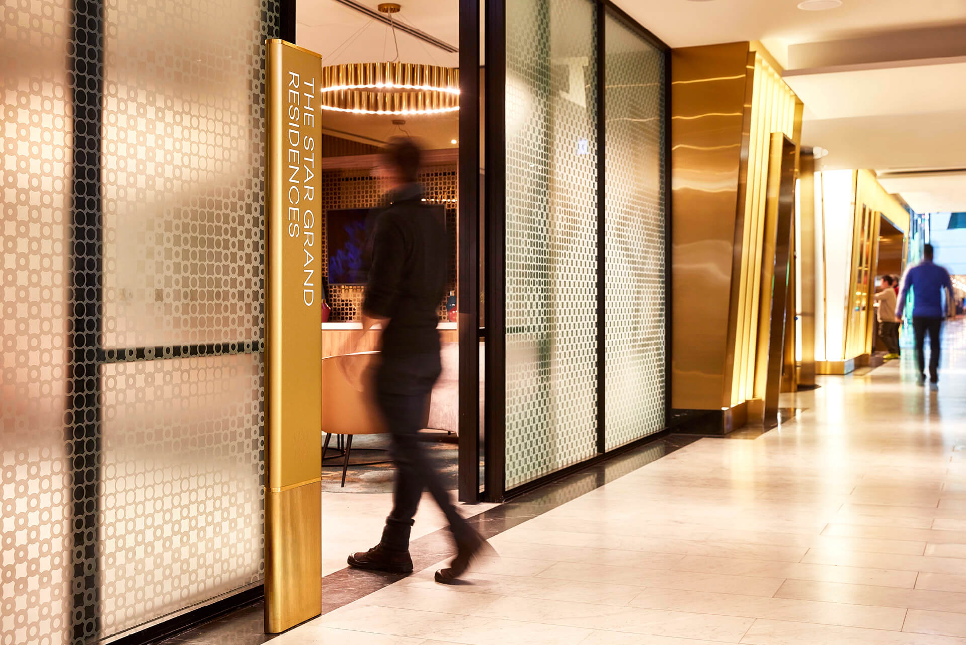
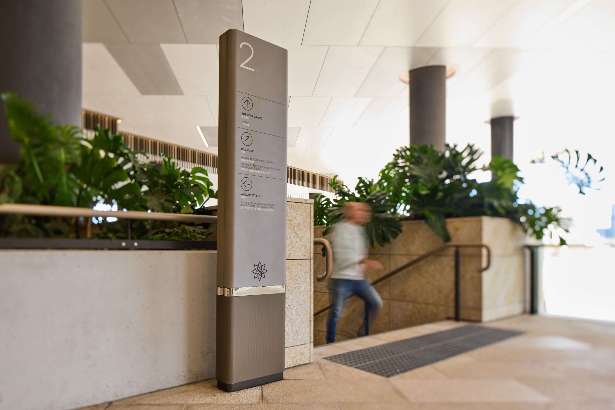
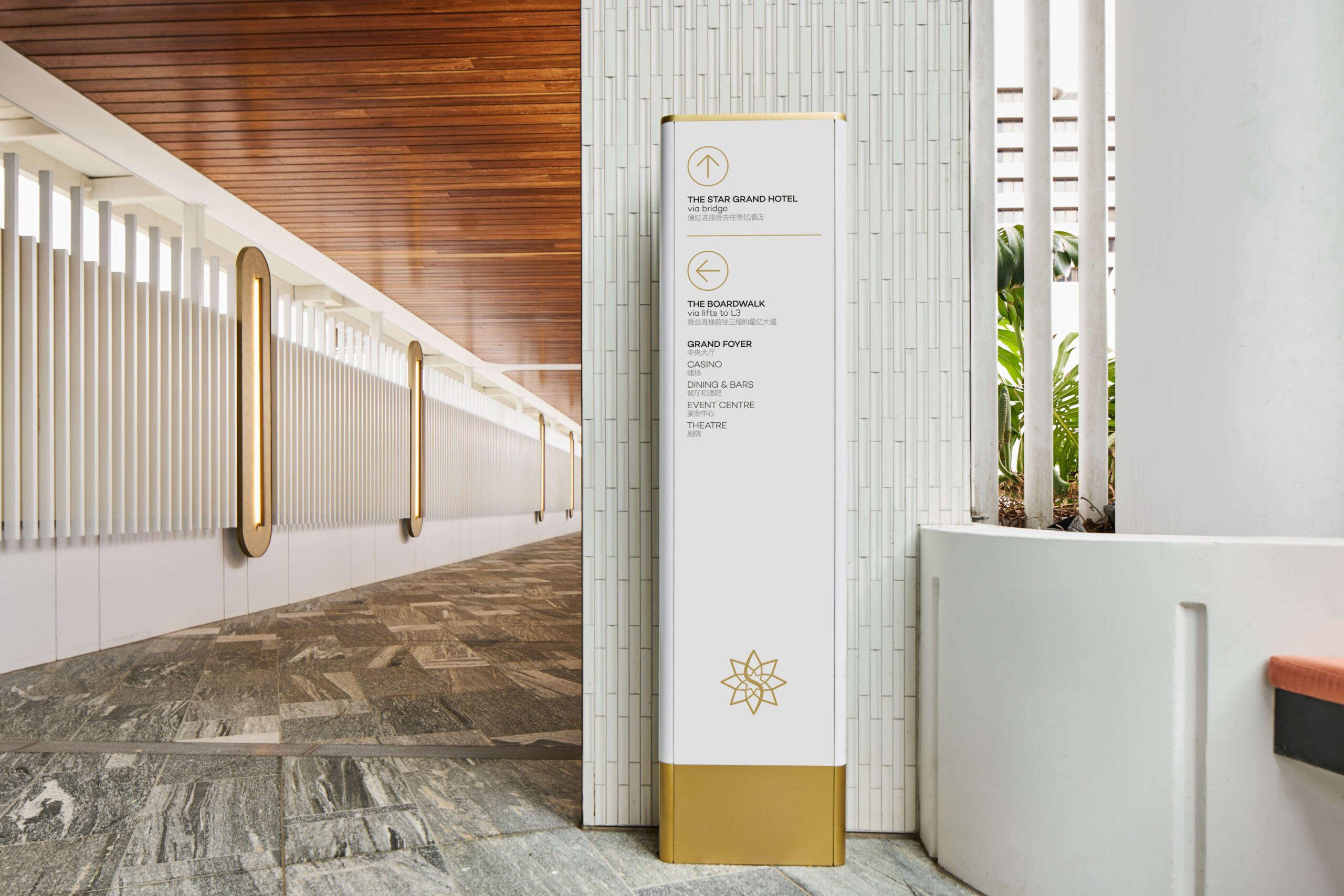
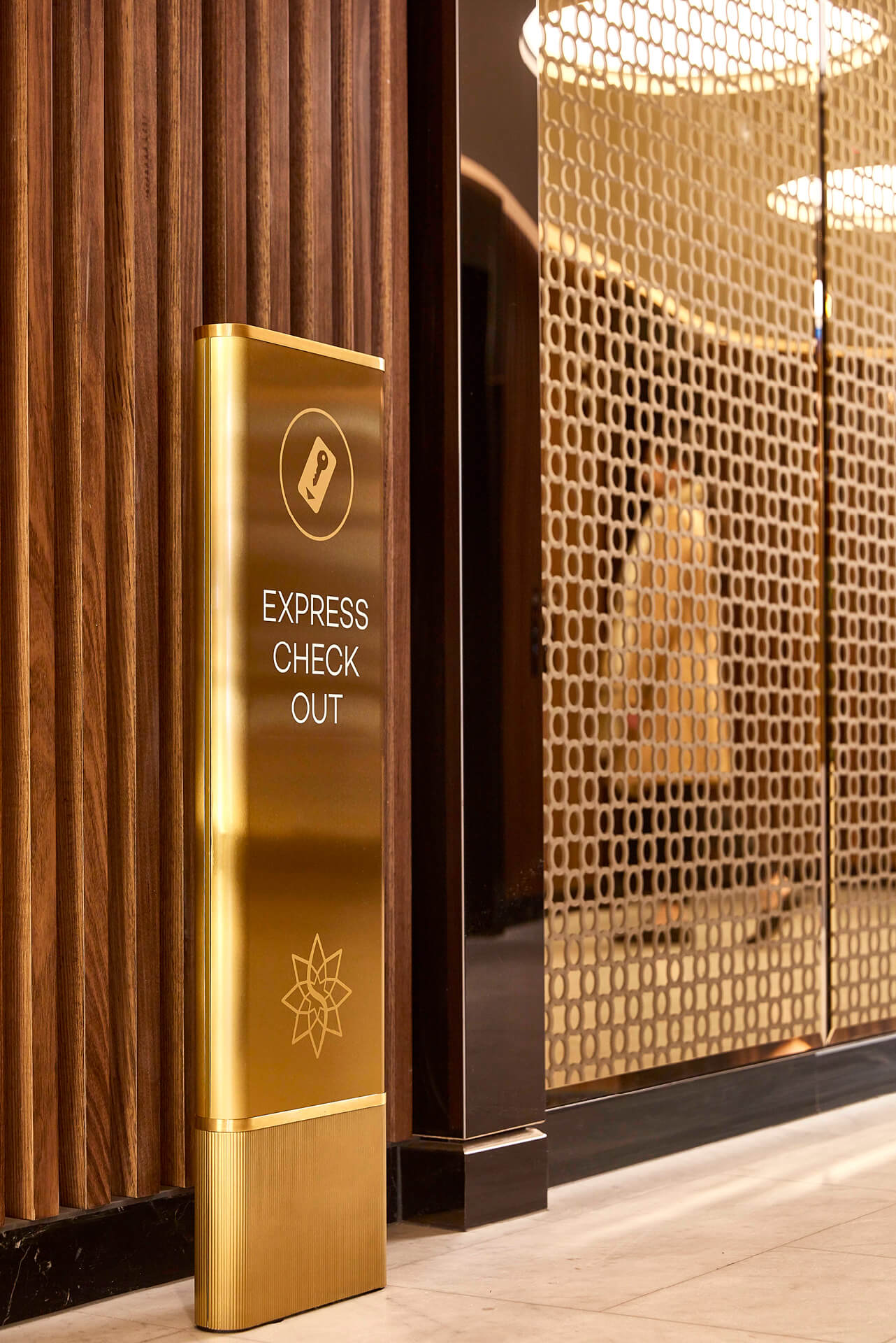
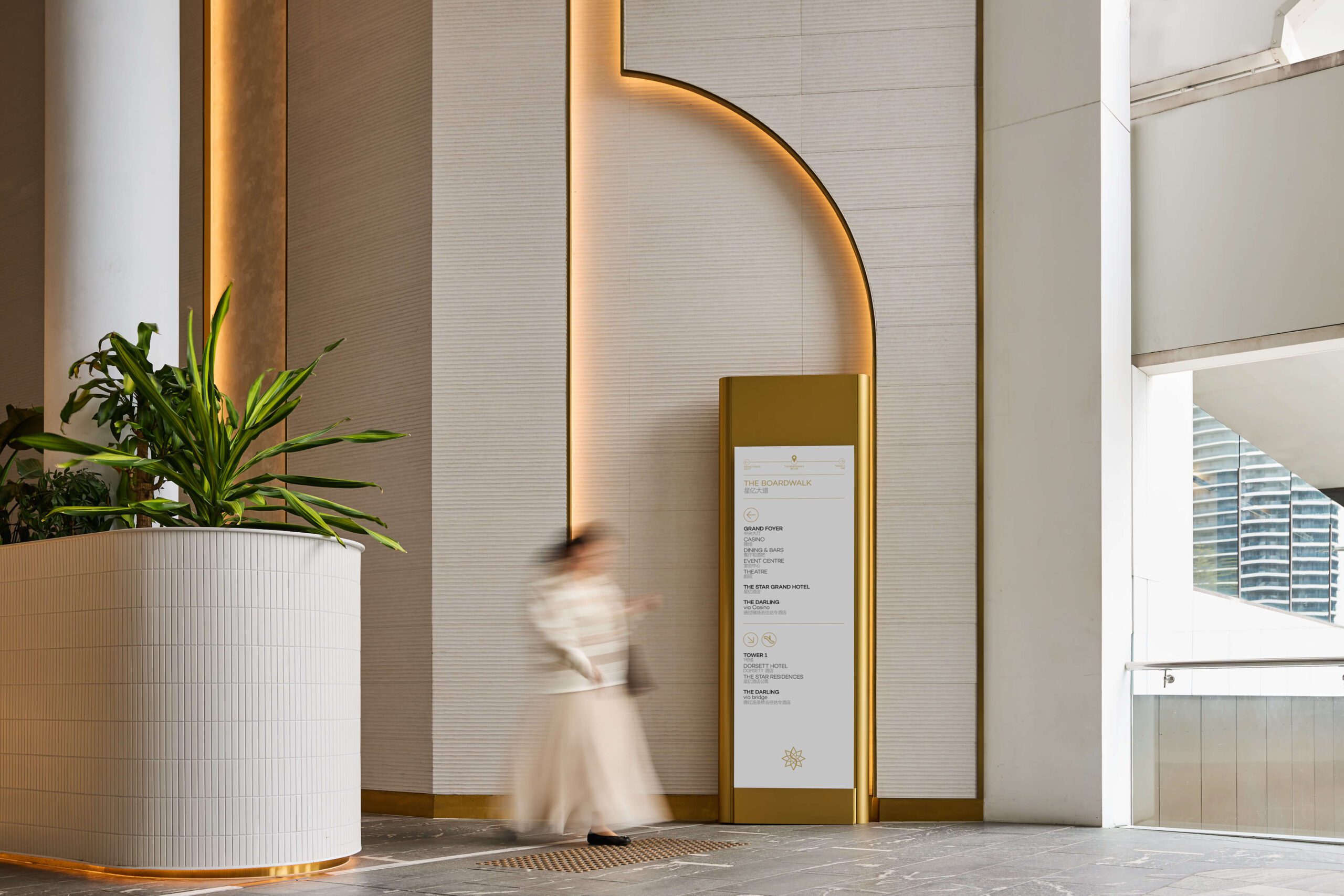
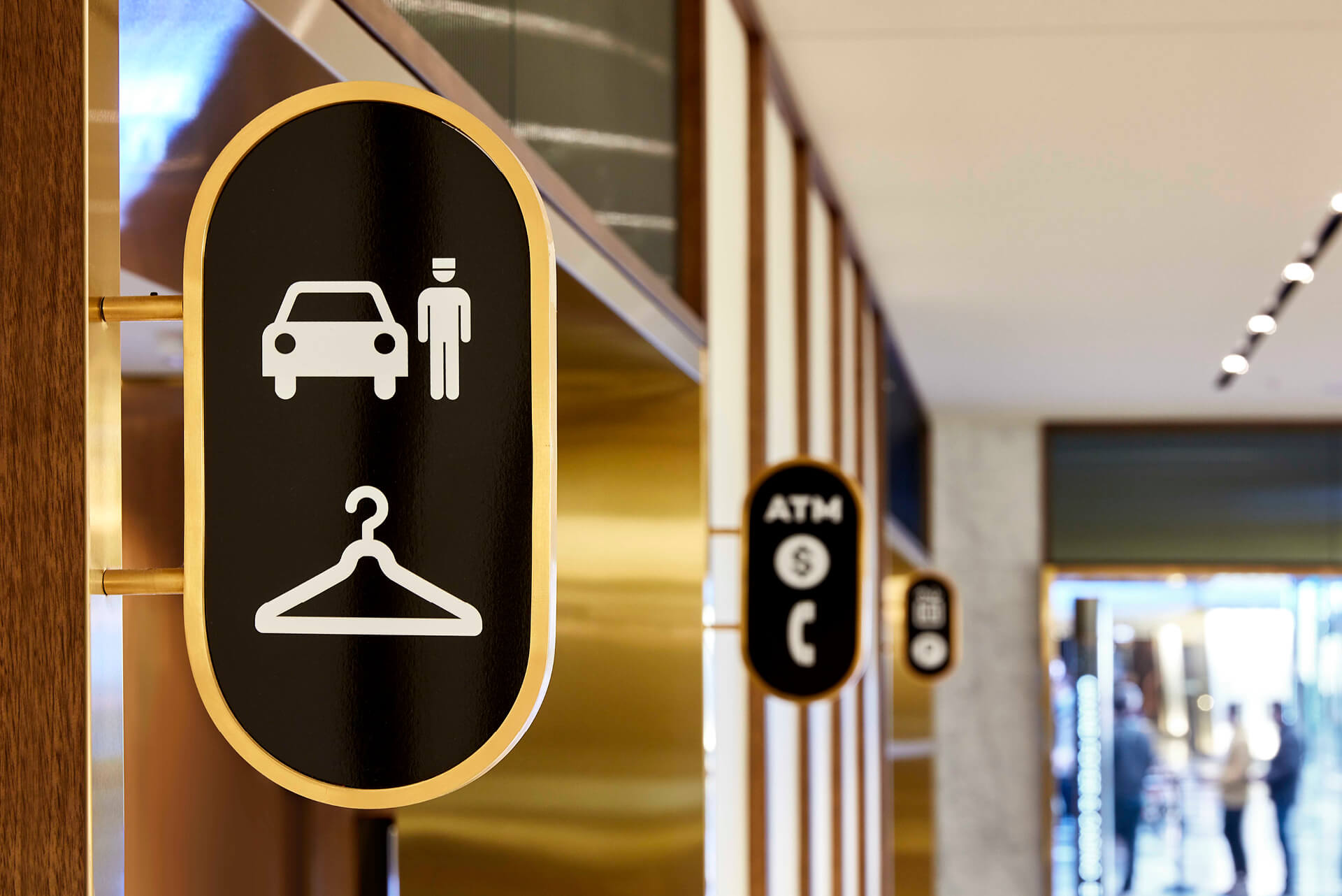
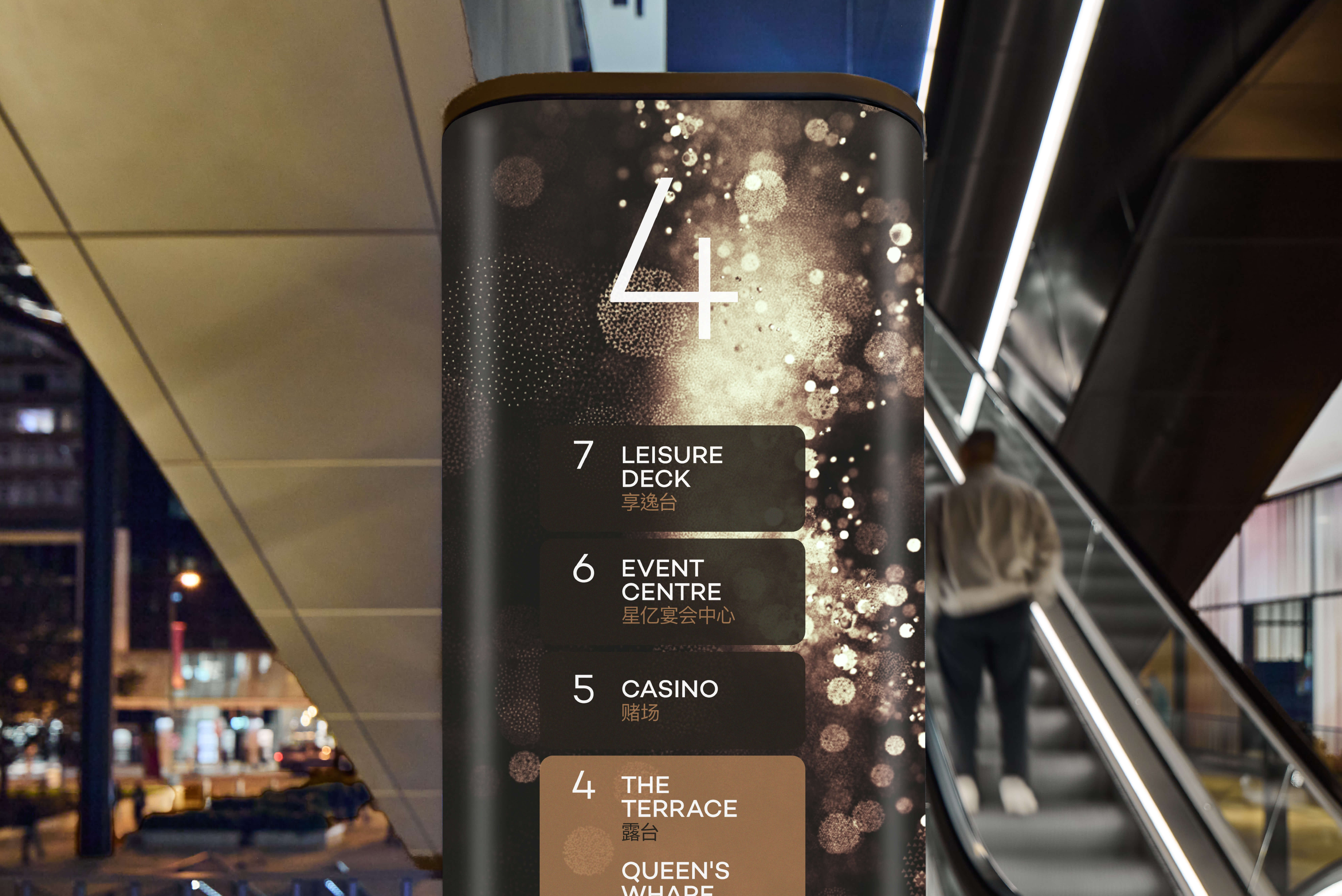
At the core of all three sites is the same sign-form language first developed in Sydney. A sleek lozenge motif drawn from the building’s design is carried across totems, directories and wall-mounted signage to feel distinctly The Star wherever it appears. Brisbane retained this same family of signtypes, typography and graphics, giving Queen’s Wharf a wayfinding vocabulary visitors would already recognise from Sydney. The Gold Coast keeps that recognition through consistent sign types and a shared graphic language, extending the system once more.
Scaling and Softening
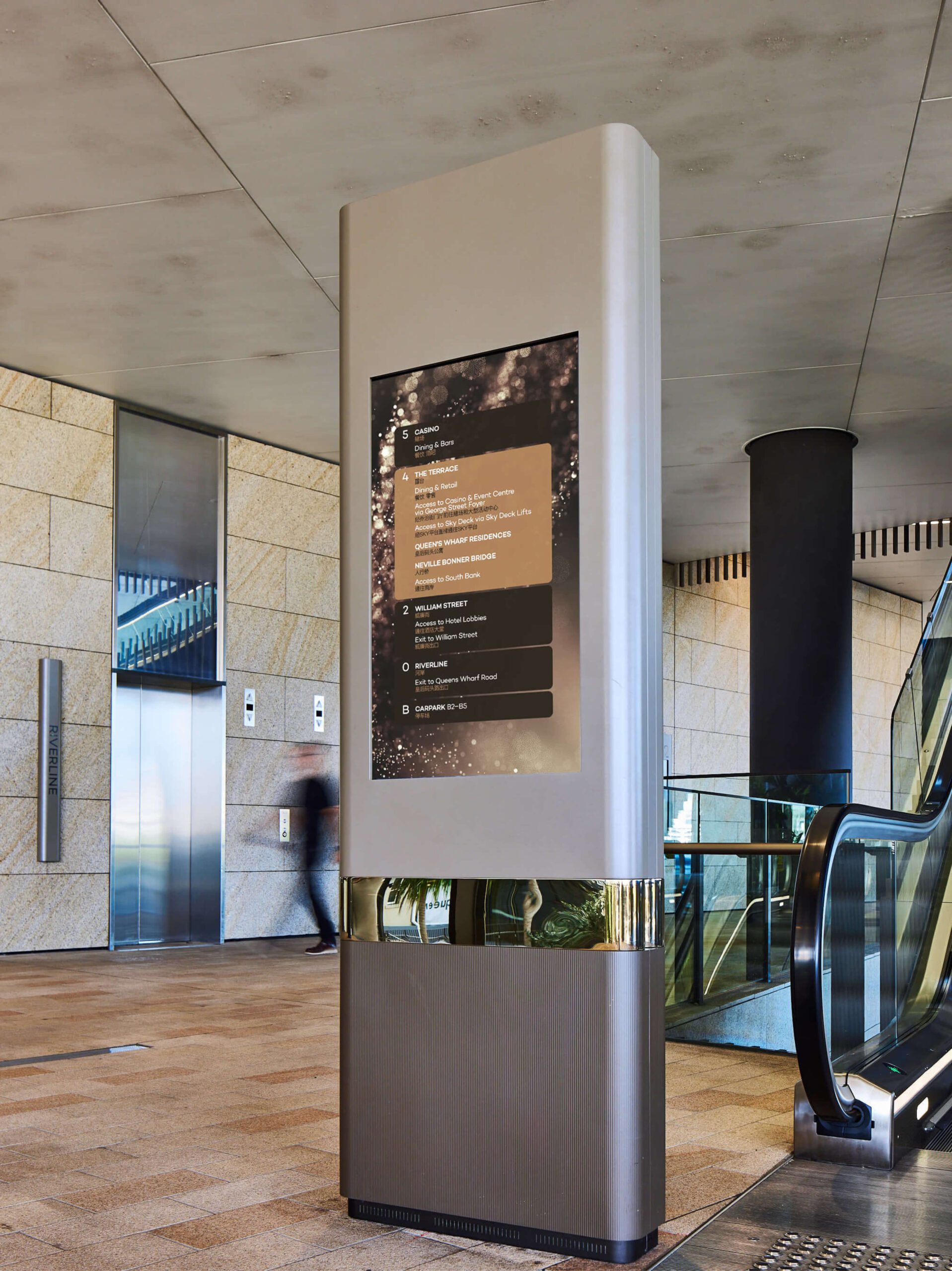
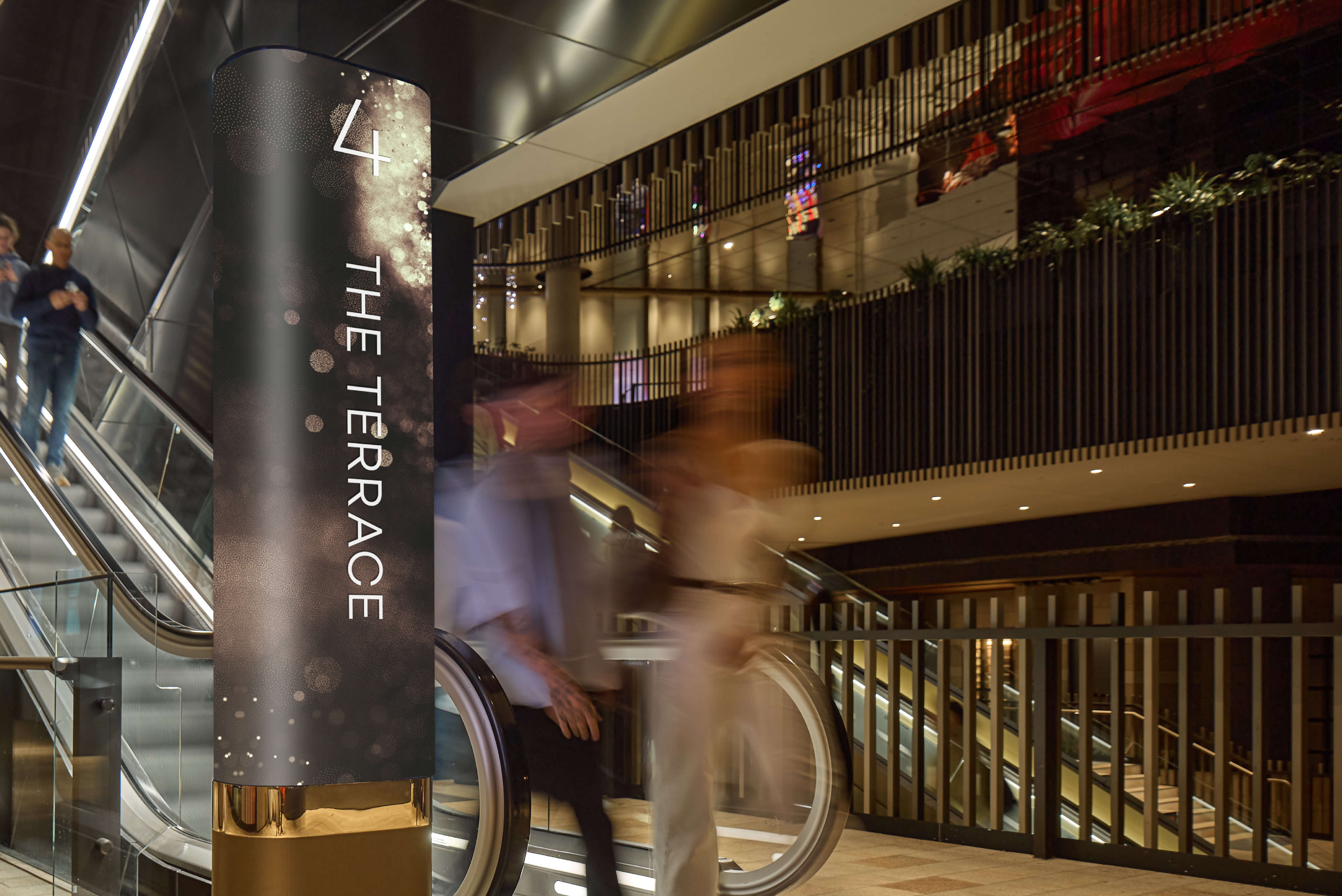
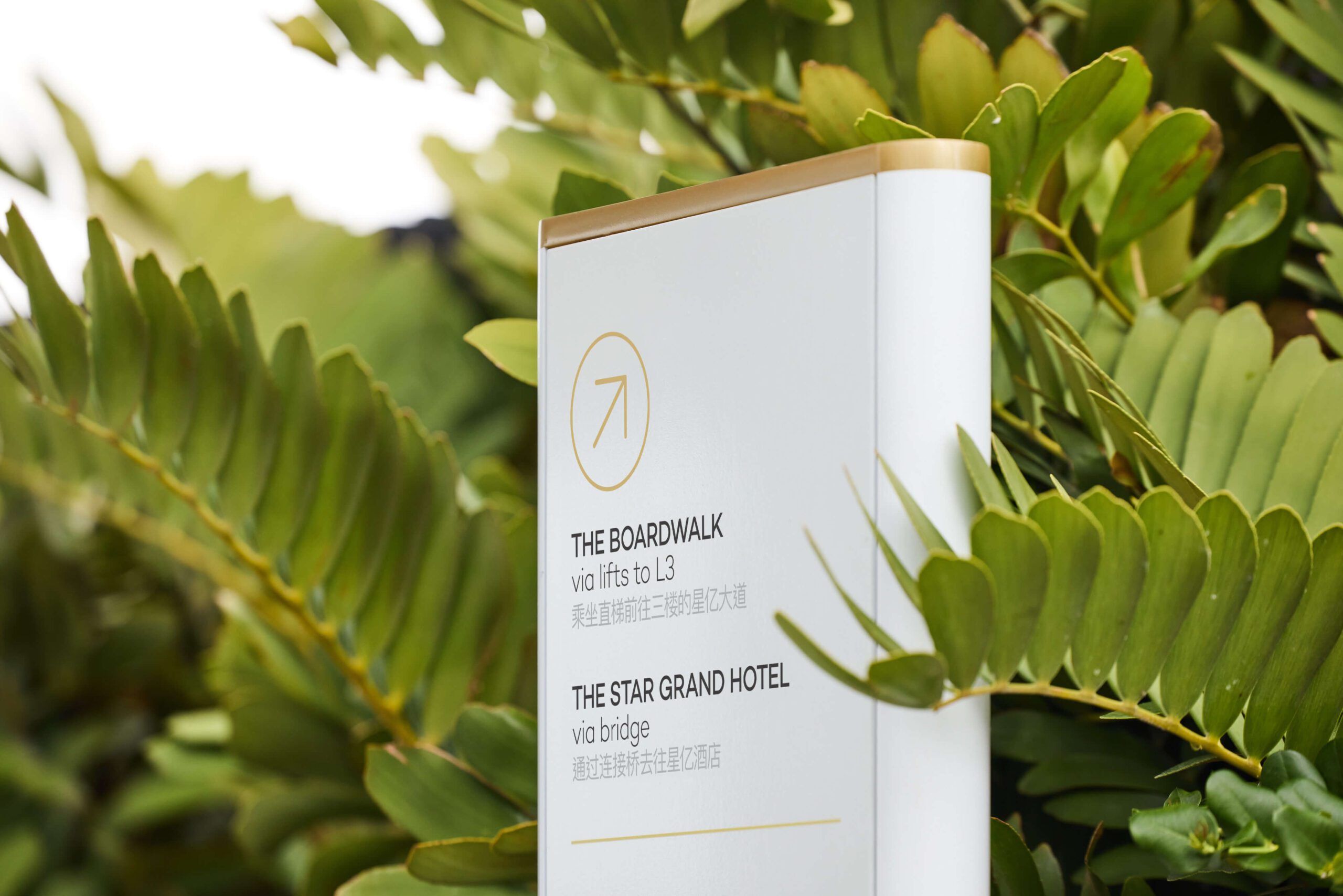
What changes from site to site is how that shared language is calibrated to each context. Sydney’s high-stimulus gaming and hospitality floors called for a digital-forward, attention-grabbing expression. Brisbane inherited that same digital backbone but had to stretch it across a multi-level, riverside precinct. The Gold Coast moves in the opposite direction – rather than scaling up, it dials back, trading urban materials for softer, subtropical ones suited to a more open, light-filled resort. Across all three, materiality does the work of localising the system while the underlying form stays constant.
Digital as Infrastructure
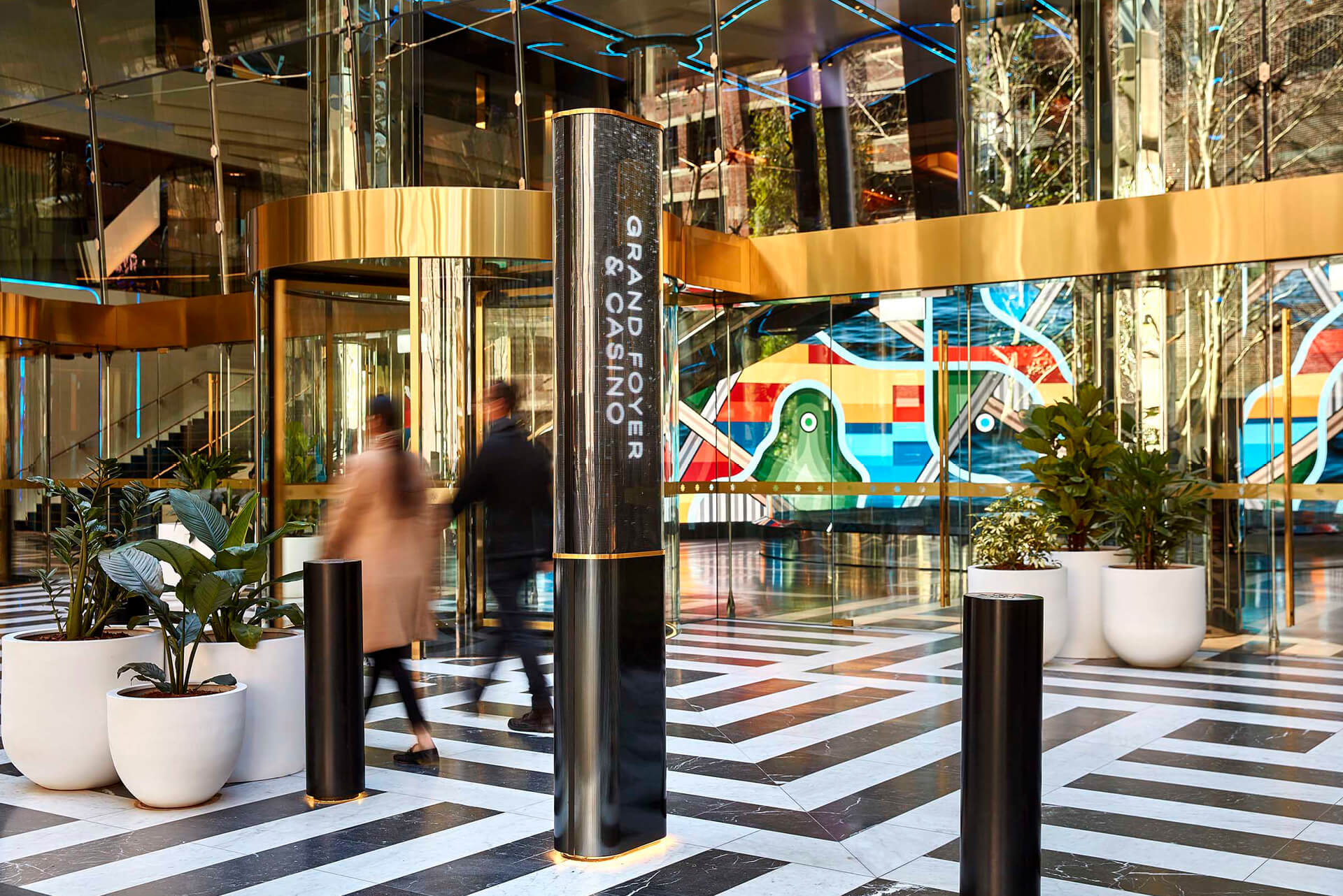
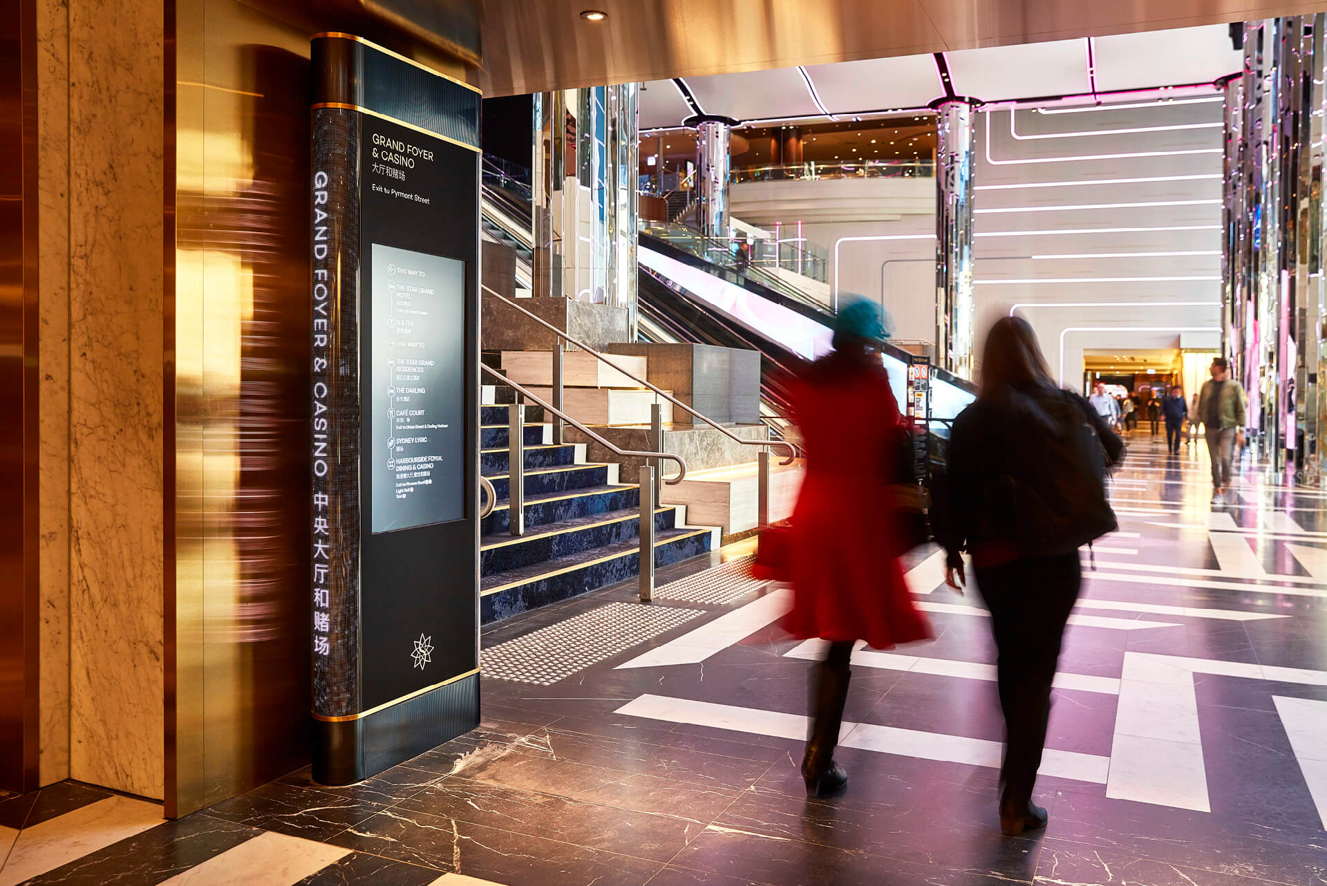
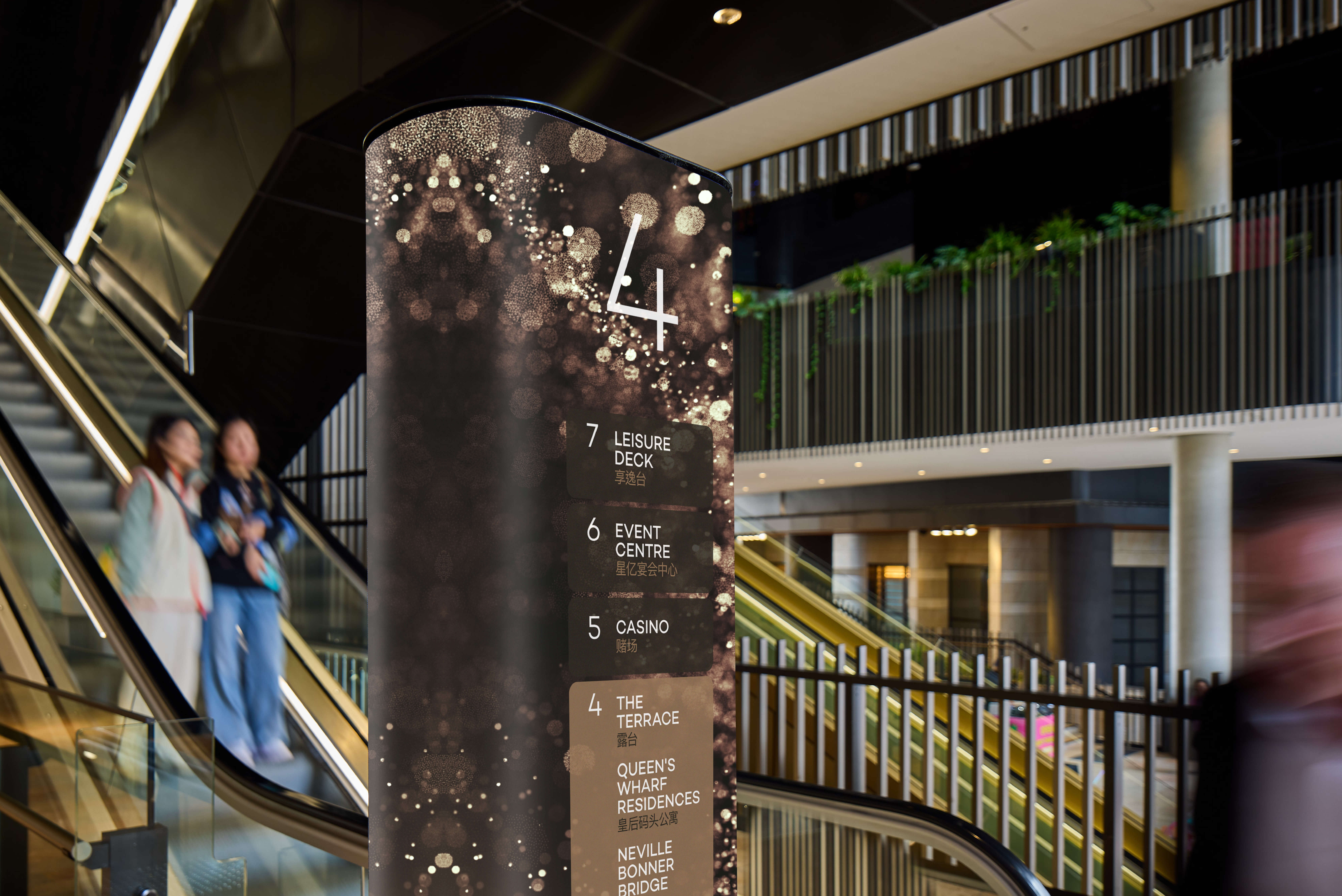
Technology is a connective thread running through the family. Sydney first introduced digital totems, animated LED forms and embedded touchscreens, designed in response to wayfinding issues observed in real visitor behaviour. Brisbane scaled this further, with digitally activated totems delivering the majority of wayfinding cues and touchscreen kiosks letting visitors curate their own path through a considerably larger precinct. This technology integration is a reminder that across the family digital screens aren’t merely a decorative layer, but core infrastructure that can scale to match each site’s size and energy.
A System Built to Grow
Considered as a whole, The Star’s wayfinding demonstrates what a considered, evidence-based system can do over time by holding its identity across three very different places. Consistency of signage touchpoints gives visitors a sense of familiarity as they move between destinations, with deliberate shifts in materiality, scale and digital intensity allowing each site to feel like its own place rather than a copy-paste of the last. It’s this balance that lets the system work as both infrastructure and brand, aiding the creation of an improved guest experience that is unmistakably The Star.